Before we dive in, let’s take a look at some examples.
Reference Sites
Design systems typically have a reference site, they come in all shapes and sizes. There’s some excellent examples from Google Material, IBM Carbon, Shopify Polaris. These are all really advanced examples that have existed for at least a decade, hundreds of people have invested thousands of hours in making them a useful resource for building within their respective ecosystems.
There’s also some more practical examples that use Storybook like Audi design system, Microsoft’s Fluent, and even Wix.
Storybook Information Architecture
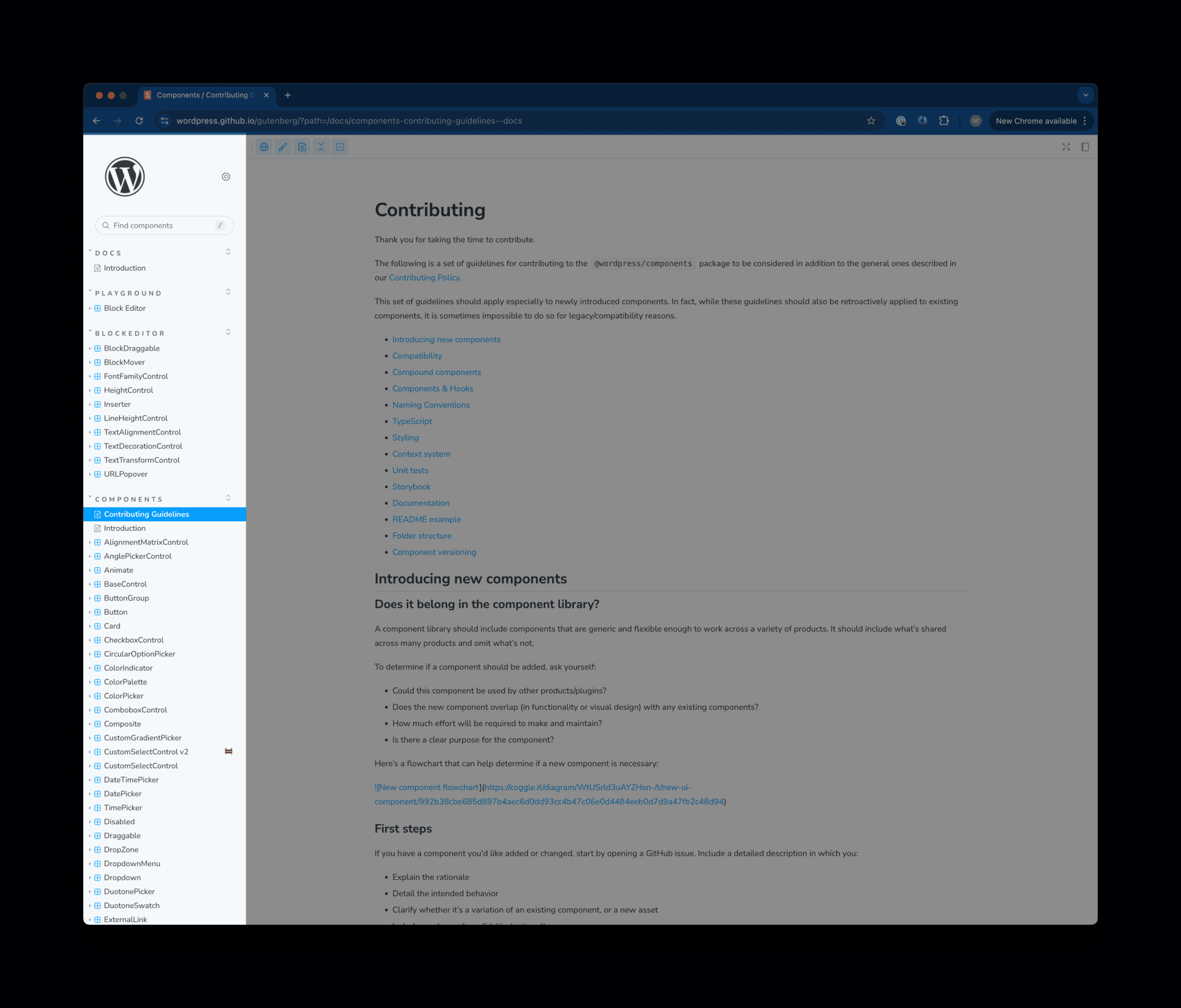
When you compare these examples to what we have, our Storybook site has a lot of room to grow and improve as a reference site for designers, developers, or anyone who wants to build and contribute to WordPress.
One thing that stood out was the left-hand sidebar A sidebar in WordPress is referred to a widget-ready area used by WordPress themes to display information that is not a part of the main content. It is not always a vertical column on the side. It can be a horizontal rectangle below or above the content area, footer, header, or any where in the theme., it’s really challenging to understand how it’s organized.

I mapped out how the Storybook site is currently structured.

I also mapped out some proposed updates for how we could organize what we have today and what might be useful to add in the future.

Request for Feedback
I’d appreciate your feedback. Here’s the link to the FigJam file. Everyone should be able to view and comment.
- Is the overall structure logical and easy to follow?
- Do the new sections (e.g., Foundations, Tokens, Patterns) make sense?
- Do you think this will be easier to navigate?
- Are the section names clear and intuitive?
- Is the component categorization well-organized?
- What’s missing?
What would change?
The changes from the current site structure to the proposed site structure mainly reflect a reorganization and refinement of content categories, with additional sections and pages. Here are the key differences:
Overall Structure
- Current Structure: Primarily focuses on functional components, private APIs, and general tools. Content is grouped into broad categories like Block Block is the abstract term used to describe units of markup that, composed together, form the content or layout of a webpage using the WordPress editor. The idea combines concepts of what in the past may have achieved with shortcodes, custom HTML, and embed discovery into a single consistent API and user experience. Editor, Components, and Contributing Guidelines.
- Proposed Structure: Introduces a more comprehensive organization with sections like Foundations, Tokens, Components, and Patterns. These sections offer clearer divisions and a more systematic approach, enhancing navigation and discoverability.
Component Categorization
- Current Structure: Components are presented in a single list
- Proposed Structure: Components are categorized into sub-groups such as Actions, Containers, Feedback, Layout, Lists, Navigation, Overlays, Selection & Input, and Utilities. This organization improves clarity and ease of use.
New Sections Added
- About WP DS contains all the meta Meta is a term that refers to the inside workings of a group. For us, this is the team that works on internal WordPress sites like WordCamp Central and Make WordPress.-information about the system, what it is, who’s it for, etc
- Getting Started contains everything a designer, developer, or anyone looking to get involved might need to know to get started.
- Contributing goes deep on how contribution works, kinds of contribution, guidelines, etc
- Foundations includes the most fundamental parts of our system, including Accessibility Accessibility (commonly shortened to a11y) refers to the design of products, devices, services, or environments for people with disabilities. The concept of accessible design ensures both “direct access” (i.e. unassisted) and “indirect access” meaning compatibility with a person’s assistive technology (for example, computer screen readers). (https://en.wikipedia.org/wiki/Accessibility), Brand, Content, and Design Language.
- Accessibility can link to the existing accessibility guidelines, but I’d love to work and speak with Accessibility team more and understand how we can work together to elevate accessibility.
- Content introduces guidelines for voice and tone, grammar, and best practices for writing.
- Brand and Design Language house all the guidelines for the design related elements like Color, Typography, Icons, and more
- Tokens documents the use of design tokens, and their role in creating consistent styles across the system.
- Patterns are combinations of multiple components within our system that work together to accomplish a common task, helping ensure cohesion and consistency across pages. These are similar in concept to the WordPress Patterns for sites, but these patterns for WordPress itself.
Next Steps
I plan on gathering as much feedback as I can. I’ll then iterate on the sitemap, and if there are no major red flags or blockers, I would likely want to start making incremental and iterative updates to storybook.
I look forward to hearing your thoughts!
#designsystems #phase-3 #design,+make.wordpress.org/accessibility/ +make.wordpress.org/core/
Relevant Github GitHub is a website that offers online implementation of git repositories that can easily be shared, copied and modified by other developers. Public repositories are free to host, private repositories require a paid subscription. GitHub introduced the concept of the ‘pull request’ where code changes done in branches by contributors can be reviewed and discussed before being merged be the repository owner. https://github.com/ Issues
- Brand and Design Language


Leave a Reply